Khlas Pay: a Payments Platform’s Website, from the First Design to the Merchant Dashboard
Altius Digital 4 min read
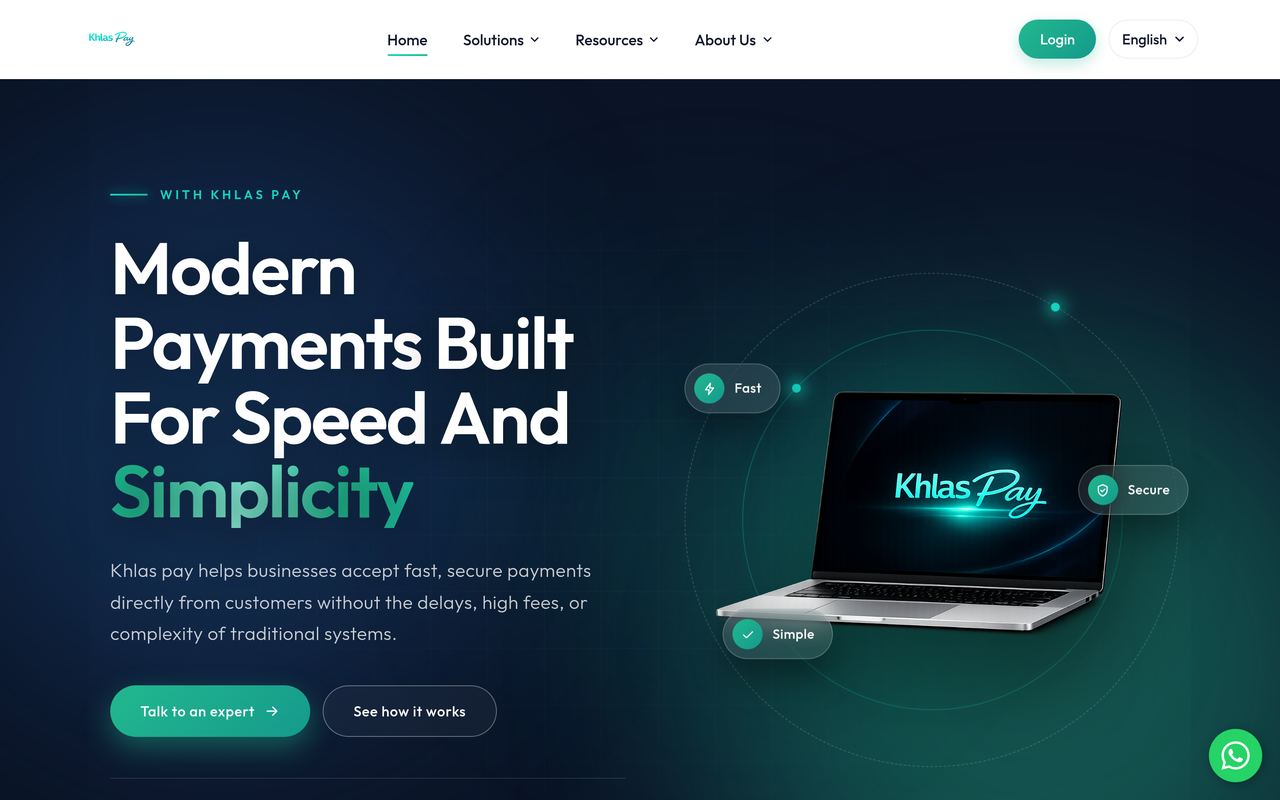
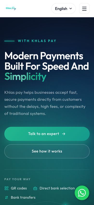
Payments are hard to explain and easy to distrust. Khlas Pay connects merchants with licensed payment service providers and acquiring banks, so a business can take payment by QR code, bank transfer or direct bank selection, across Morocco, Africa, Europe and the UK. The brief was a website that makes that feel simple, and a merchant dashboard that makes it feel safe.
What we built
The design
- A brand system for a fintech. One teal accent on deep navy for the hero and the key moments, white for everything you read, a geometric sans-serif (Outfit) throughout, and a small set of components: pill buttons, feature cards, step markers, FAQ accordion.
- The product on the page. The hero shows Khlas Pay on a laptop with its three promises (fast, secure, simple) floating around it, so a merchant understands what it is before reading a word.
The pages
- Home: how it works in three steps (choose a payment method, authorise, settle), the payment infrastructure, the e-commerce checkout, latest articles, questions, and the enquiry form.
- Solutions: How it works, E-commerce payments and Prices.
- Resources: FAQs and a blog, including a developer tour of the Khlas Pay REST API: payments, refunds and accounts, a hosted checkout URL to redirect to or embed, webhooks for completed and failed payments, a sandbox for every account and idempotency keys on every write.
- Company: About, Become a partner, careers and contact, with the Tangier office on a map.
The merchant dashboard
The product behind the Login button: the workspace a business opens every morning to see what is moving through it. Designed in the same system as the website, dark and calm, with one green accent for money and status.
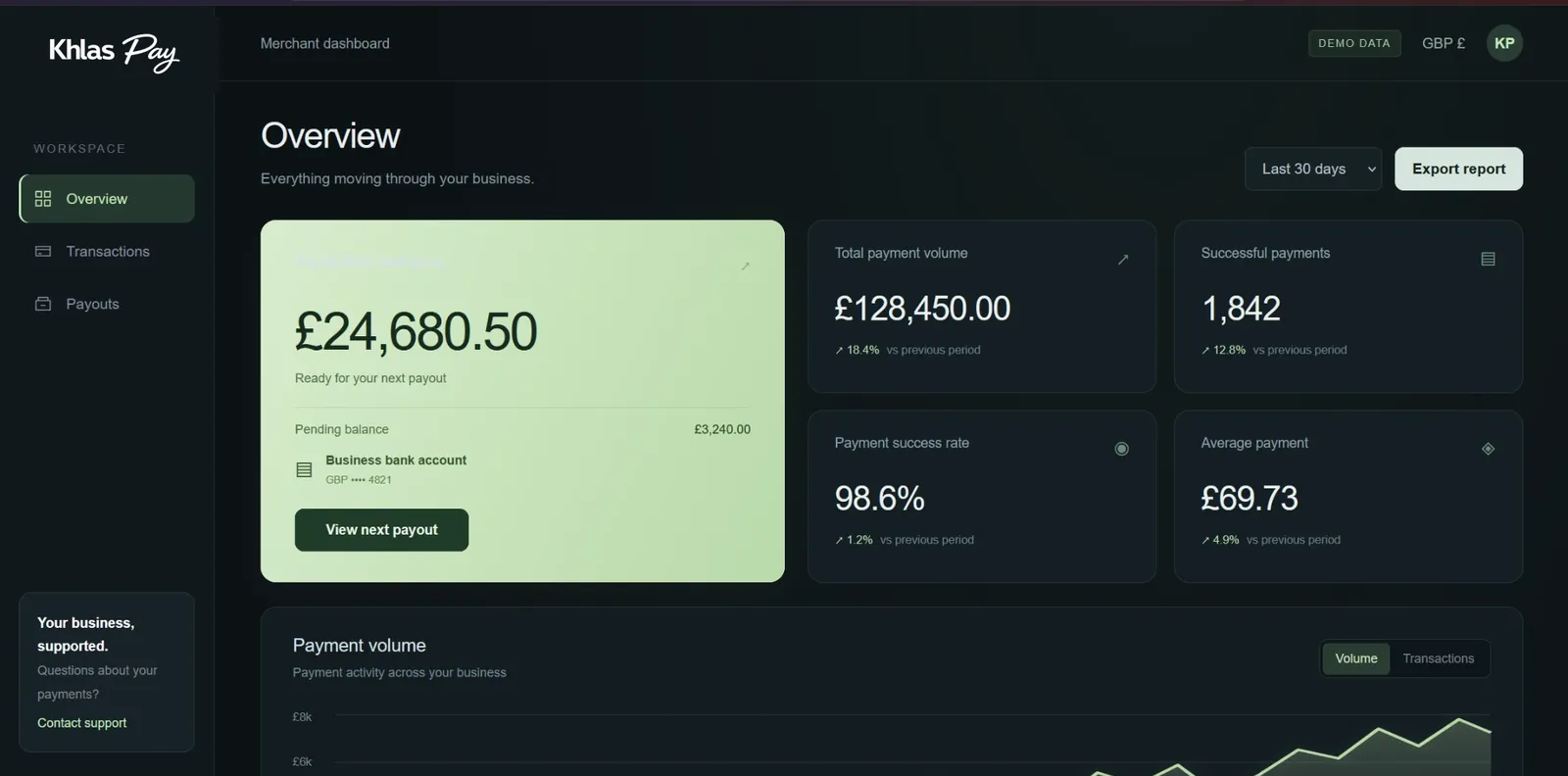
- Overview. Available balance ready for the next payout, pending balance, the business bank account it pays into, and a “View next payout” action. Beside it, the numbers that matter: total payment volume, successful payments, payment success rate and average payment, each against the previous period.
- Payment volume chart. Current period against the previous one, switchable between volume and number of transactions, with a date range selector (last 30 days and others) and an export to report.
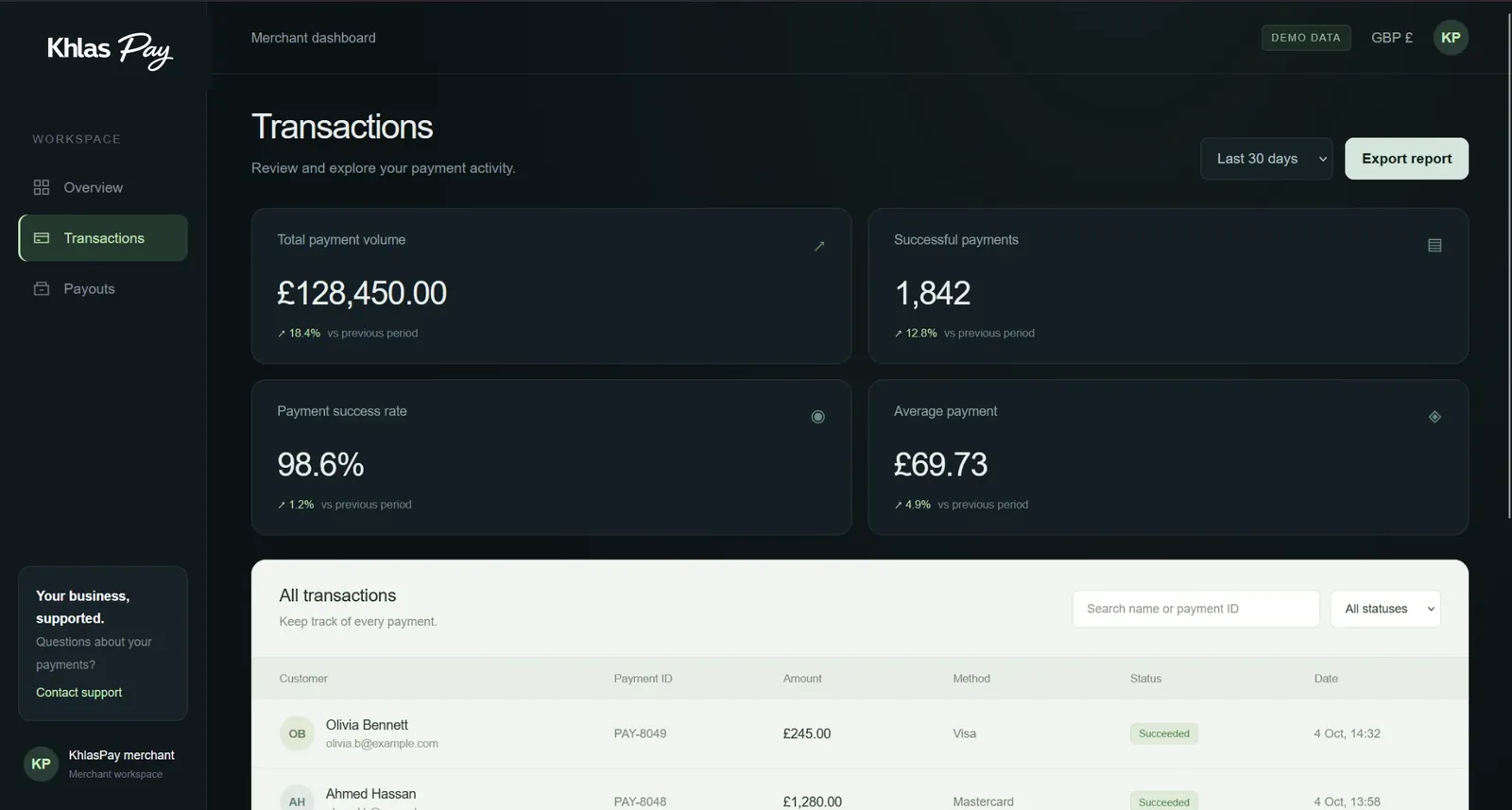
- Transactions. Every payment in one table: customer, payment ID, amount, method (Visa, Mastercard, Apple Pay, Google Pay), status (succeeded, pending, failed) and time. Search by name or payment ID, filter by status, page through the history.
- Payouts. Settlement activity and upcoming transfers: each payout’s reference, destination account, amount, status (scheduled or paid) and arrival date, with the same date range and export as the other pages.
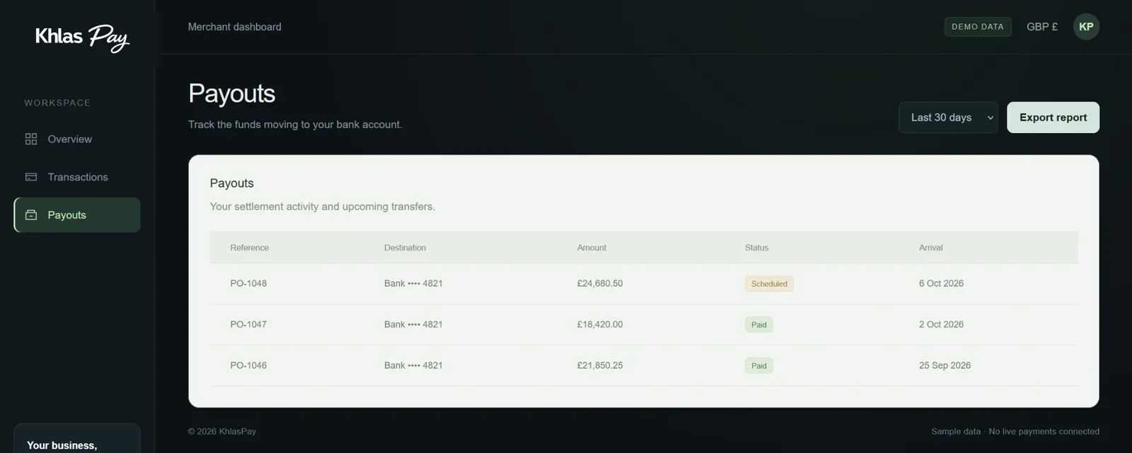
- The small things. Currency shown per workspace, a support card always in reach, and a clear “demo data” label when the workspace is showing sample figures rather than live payments.
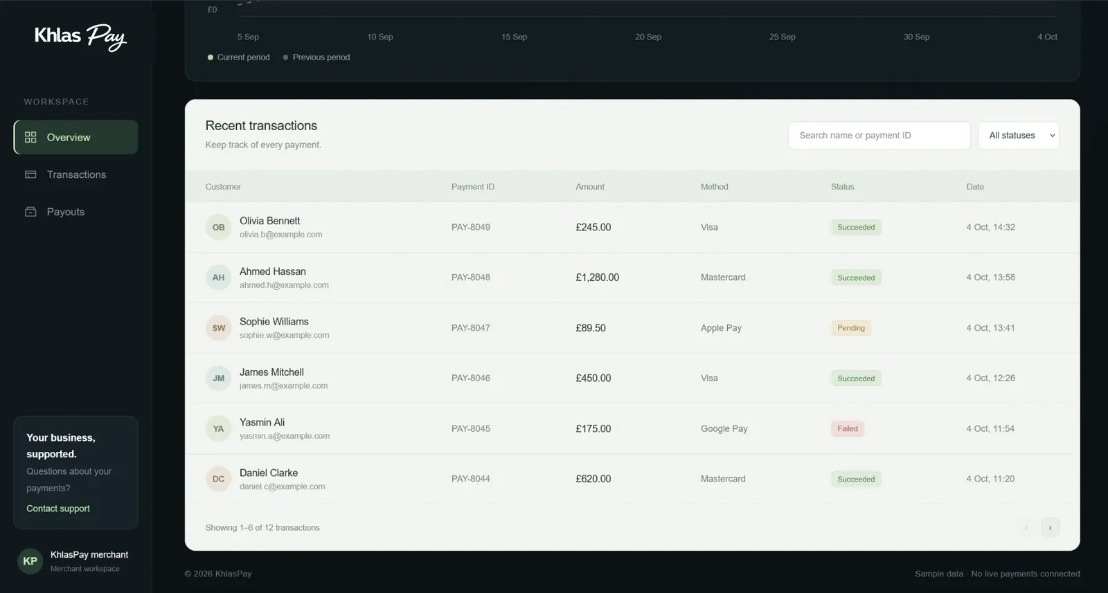
The dashboard screens above show sample data, not real merchants.
The integrations
- More than one language. A translation layer serves the site in several languages from one set of pages, with a language switcher in the header.
- Enquiries routed properly. The form captures first name, last name, company, email, business type, monthly volume and a message, with a hidden bot check, so the right person replies to a real merchant.
- WhatsApp, Maps and social. One tap to chat, one tap for directions to the office, and links to the company’s Facebook and Instagram.
Behind the scenes
- Clean addresses and search titles for every page, and the content structured so Google and AI search can read what the company does.
- Images served resized per screen; the heavy hero graphic is the only large asset.
- Pages, prices, questions and articles are editable by the Khlas Pay team; new languages are added in the translation layer rather than by rebuilding pages.
Why it looks the way it does
Payment companies tend to shout. Khlas Pay’s audience is a merchant deciding whether to trust a new way of being paid, so the design is calm: one accent colour, generous space, short sentences and a clear path to a human. The hero and the proof points sit above the fold on a phone, which is where most merchants first see it.
The scroll-through
The recording above is the live site, desktop and phone, as it is today. Nothing is mocked up.
What the client can do themselves
Prices, questions and blog posts are editable by the Khlas Pay team without us. New languages are added in the translation layer rather than by rebuilding pages.
Khlas Pay is a client of Altius Digital. The recording is of their live website at khlaspay.com.